How a user feels when they visit your website is a great barometer for whether or not they’ll continue to engage with your brand. The best way to influence feelings? Create a great user experience.
UX increases key performance indicators (KPIs) like retention, customer acquisition, and sales by 83%.
At the heart of a great user experience is seamless navigation. Your user should be able to find what they’re looking for immediately, and navigate to that information with ease. This navigation should be facilitated with elegant, simple design.
Last week, we ranked the top 50 content marketing brands of 2014. Here are the best examples of UX from that list.
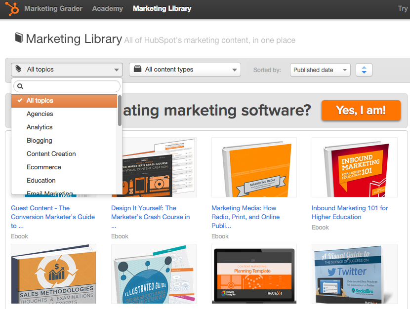
HubSpot
HubSpot pumps a lot of content into their Marketing Library. But that doesn’t mean it’s overwhelming to sift through. All HubSpot assets are organized by topic and content type, making it easy to find the content you need. And if you’re looking for a specific asset, just type the title into the search bar.
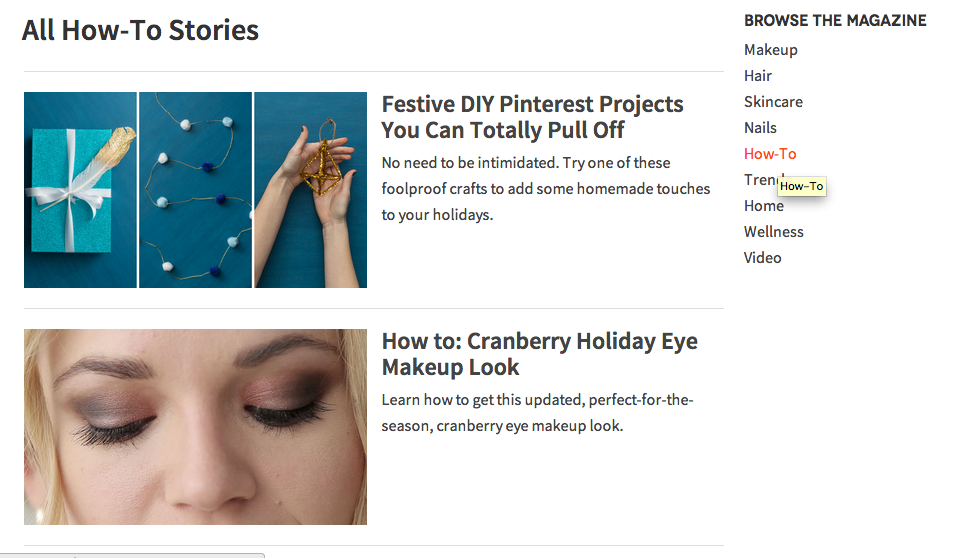
Birchbox
Birchbox’s “less is more” approach to UX and navigation works well. Products and how-to tips are organized by category and gender in the navigation bar, so you don’t have to go digging through content to find what you need.
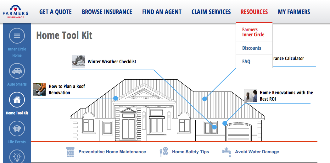
Farmers Insurance Group
Farmers Insurance Group’s “Inner Circle” content hub is a delightful content experience. It provides users with all the information they need through a seamless and entertaining site structure. Content is organized in mjaor insurance buckets: auto, life events, and home. And their “toolkits” give visitors valuable practical knowledge that will help inform future decisions.
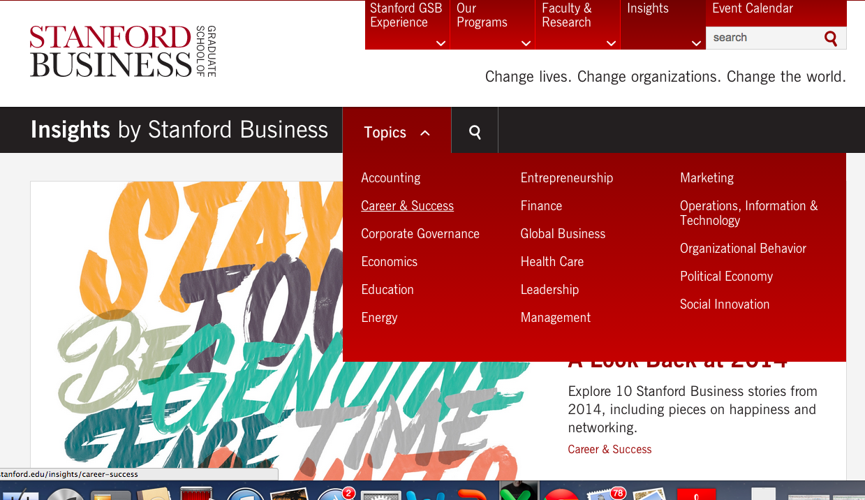
Stanford Graduate School of Business
Sometimes, you just want to browse through content. Especially if that content is made up of articles by some of the leading business minds. Other times, you’re looking for information on a specific topic. Stanford Graduate School of Business’ “Insights” section provides users with the opportunity to both browse and filter their content by a wide range of business topics.
Square
Many company product pages I come across are infuriatingly opaque and vague. Not Square’s. Delightfully designed product pages tell me what the product is, how it works, why it’s useful, who it’s for, and how much it costs in succinct, plain english. No frills, no jargon; just useful information.
